Table of contents
- Prerequisites
- What is CustomPainter?
- How it works
- Practice
- First Test: Drawing a House
- Test Two: an Animated World Clock
- Source code
- Conclusion
- References
- 🚀Stay Connected!
In this tutorial, we'll see how you can use your creativity by drawing the components you want with the Flutter Custom Painter.
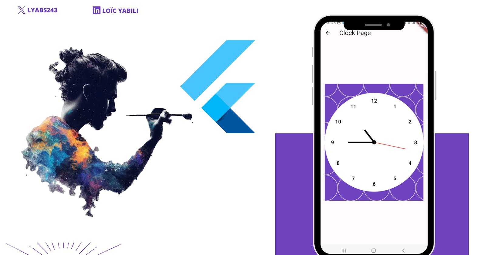
At the end of this article, we're going to use the Custom Painter to create an animated world clock from scratch.

Flutter: Personalized World Clock
Pay attention, maybe by the end of this tutorial you'll become the modern-day 😃 Picasso.
Prerequisites
The CustomPainter is an advanced notion of Flutter, to be able to read this tutorial well you need to have some basic knowledge of Flutter and Dart.
What is CustomPainter?
The CustomPainter class allows you to draw custom graphic elements, whether simple or complex.
It's often used when you want to create elements that you can't get with standard Flutter widgets.
Examples of use
A complex diagram: Even though there are a multitude of packages offering different types of widgets, you may find yourself in a situation where you want to create a diagram of your own, the CustomPainter is the best option.
A thermometer: if you have a medical application, you can create a visual of a thermometer to represent the temperature of a patient, by associating an animation with it the rendering will be just magical 😍
Clouds: You can create custom shapes to represent the weather in a weather app.
The possibilities are endless, your only limit is your imagination.
How it works
Photo by Simone Mascellari 🇮🇹 on Unsplash
To better understand how it works, you need to think of yourself as a painter who uses his brush to paint his painting. (Do you believe me now when I say you could become the next Picasso?) 😁
The painter takes his brush, puts it in a painting of a specific color, and uses it on his painting drawing the shapes he wants with sizes he wants; that's exactly what happens with the CustomPainter.
The painter is you, your brush is the Paint object to which you will give properties such as color, and thickness,...to draw on your board which is the Canvas.
Technically, you need to:
To create a class that inherits from the CustomPainter class, it has two main methods:
paint: The method where you're going to use your creativity to draw whatever you want on the Canvas, the method also takes as a parameter the size to allow you to situate yourself.
shouldRepaint: here you will specify whether the CustomPainter should be repainted or not when the screen is refreshed, for example.
class MyCustomPainter extends CustomPainter {
  @override
  void paint(Canvas canvas, Size size) {
    // your drawing using the canvas
  }

  @override
  bool shouldRepaint(CustomPainter oldDelegate) {
    // Specify whether the CustomPainter should be repainted or not
    return true;
  }
}
Display your CustomPainter:
To display it, you need to instantiate your CustomPainter and pass it into the CustomPaint widget which will take care of displaying it on the screen.
CustomPaint(
  painter: MyCustomPainter(),
)
Practice
It's time to put it into practice!
As said above, there are two main things to consider when you want to draw:
- Paint: your brush to which you set different properties.
final paint = Paint()
      ..color = Colors.green
      ..strokeWidth = 4
      ..style = PaintingStyle.fill;
Here we create our paint object to which we give the color red, a width of 4, and a filled style which means that if we draw a shape, it will be filled by the color of the paint, the other possible option is PaintingStyle.stroke which fill the shape.
For more information, I invite you to see the documentation.
- Canvas: your board on which you are going to make your different drawings.
canvas.drawCircle(
  Offset(size.width / 2, size.height / 2),
  size.height / 6,
  paint,
);
In this example, we use our paint (the brush) to draw a circle that we will locate in the center of our component with a radius that represents 1/6th of the height of the component.
In order for your drawings to be well done and adapt to different screen sizes, it is important to place the elements on the x-axis and y-axis, in some cases you have to use mathematical formulas as we will see later (yes Maths follow us everywhere 😮 💨).
The Canvas has a multitude of methods to draw, in this article we will look at just a few methods to show a glimpse of what is possible, visit the documentation to see the complete list of the methods.
Predefined shapes
The canvas has several predefined shapes, in this article we will see 5 of them.
The line
To draw a line, we use the drawLine method, which draws a line between two points using the properties of the paint.
  final paintLine = Paint()
    ..color = Colors.green
    ..strokeWidth = 4
    ..style = PaintingStyle.fill;

  canvas.drawLine(
    Offset(0, 20),
    Offset(size.width, 20),
    paintLine,
  );
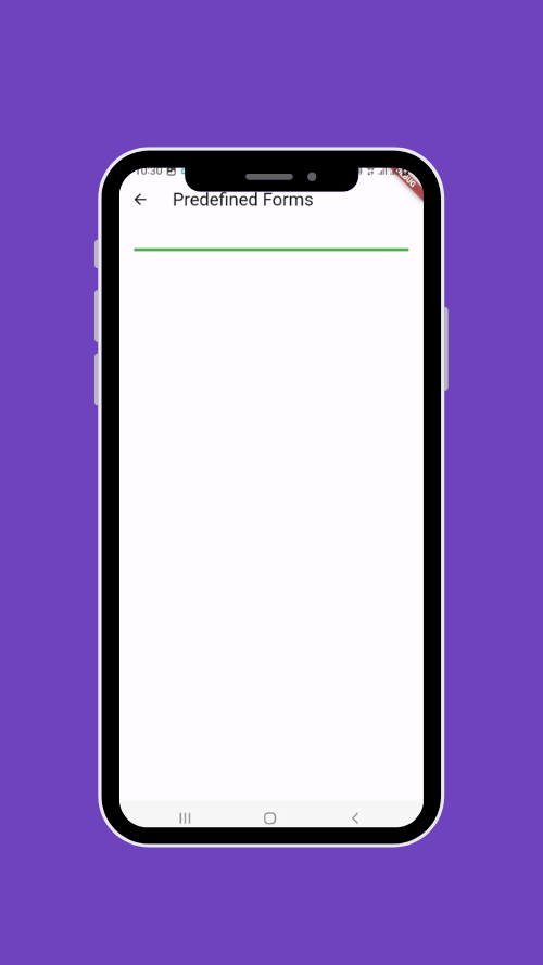
We create our Paint object with its properties (the style is useless because in the case of a line, this property is ignored since it is not a closed shape), then we draw a line that goes from the point (0,20) to the point (the end of the horizontal axis, 20).
Which gives:
The Circle
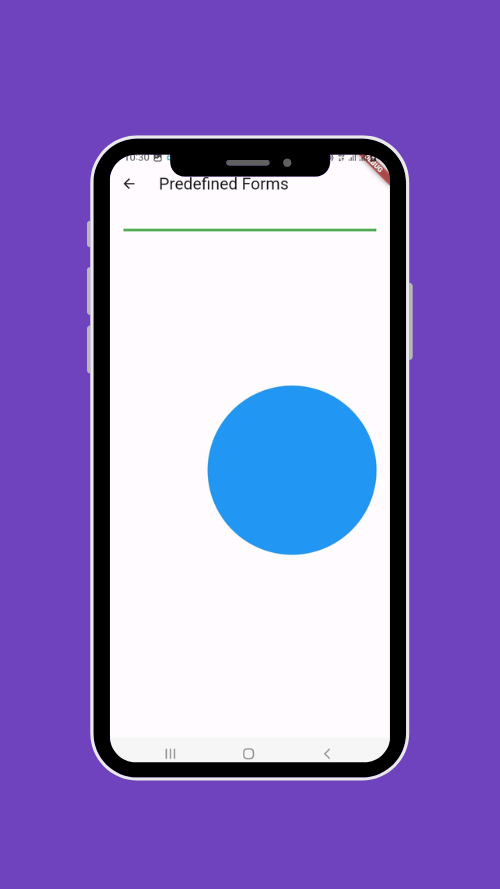
The drawCircle method allows you to draw a circle on a given point that constitutes its center, with a given radius, and all this with our paint that defines the style of our circle such as its color.
final paintCircle = Paint()
    ..color = Colors.blue
    ..strokeWidth = 2
    ..style = PaintingStyle.fill;

  canvas.drawCircle(
    Offset(size.width / 1.5, size.height / 2),
    size.height / 6,
    paintCircle,
  );
We draw a circle filled in blue that we place in the middle right of our screen, we give a radius of 1/6th of the height of our screen.
We use the size so that our shape adapts to the size or position regardless of the dimensions of our screen.
The Rect shapes
It is possible to draw rectangular shapes with drawRect which takes as a first argument a Rect object which represents the way our shape will be drawn and as a second argument our paint which we already explained.
The first argument will make the difference, it is possible to draw our rectangular shape in several ways, we will see two:
- From a center
It is possible to draw a rectangular shape from a center by using Rect.fromCenter which has as parameters the central point of our shape, its width, and height.
final paintRectangle = Paint()
    ..color = Colors.red
    ..strokeWidth = 2
    ..style = PaintingStyle.fill;

  canvas.drawRect(
    Rect.fromCenter(
      center: Offset(0, size.height / 2),
      width: size.width / 2,
      height: size.height / 2,
    ),
    paintRectangle,
  );
We draw our rectangle from the center in the middle left of our screen and give it half the width and half the height as dimensions.
Here is the result:
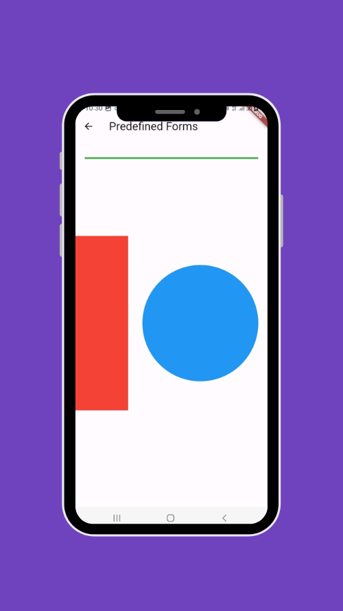
The width seems small but it's not, part of the shape is on the invisible side of our screen, to make everything visible you need to move the center point a little more to the right.
- From a circle
You can create a rectangular shape from a circle with Rect.fromCircle which takes as arguments the central point of our circle and its radius.
final paintSquare = Paint()
    ..color = Colors.orange
    ..strokeWidth = 2
    ..style = PaintingStyle.fill;

  canvas.drawRect(
    Rect.fromCircle(
      center: Offset(size.width / 1.5, size.height / 2),
      radius: size.height / 9,
    ),
    paintSquare,
  );
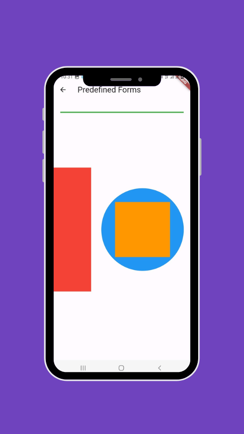
We drew an orange square in the blue circle we drew earlier.
The Oval Shape
You can draw an oval shape with drawOval which takes as its first argument the Rect object that we saw earlier and which will define the way to draw our oval, then it takes the paint object that you already know.
final paintOval = Paint()
    ..color = Colors.yellow
    ..strokeWidth = 2
    ..style = PaintingStyle.fill;

  canvas.drawOval(
    Rect.fromCenter(
      center: Offset(size.width / 2, size.height / 2),
      width: size.width / 2,
      height: size.height / 2,
    ),
    paintOval,
  );
Draw a yellow oval from the center of the screen.

The Arc
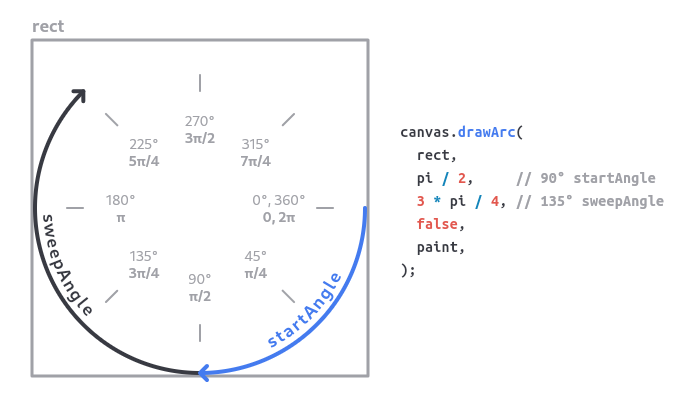
You can draw an arc by using drawArc which first takes the Rect object that will encompass our arc, the starting angle in radians, the scan angle in radians as well which determines how much of the angle will be drawn (the sum of the starting angle and the scan angle gives the total size of the angle), a Boolean which specifies whether the arc will be a closed shape or a simple line and finally the Paint object.
Here, things get a little tricky... To find the value in radians, we use this formula: radians = degrees * (pi / 180).
Here's how it can be represented:
final paintArc = Paint()
    ..color = Colors.purple
    ..strokeWidth = 2
    ..style = PaintingStyle.stroke;

  canvas.drawArc(
    Rect.fromCenter(
      center: Offset(40, 40),
      width: size.width / 2,
      height: size.height / 5,
    ),
    0,
    3.14,
    false,
    paintArc,
  );
Here we draw an arc in a rectangle with (40,40) as the center, with a starting angle of 0 radians which represents 0 degrees (the horizontal to the right), a sweep angle of pi (3.14) which represents 180 degrees, we define that our arc will be a simple line by setting false to the third argument and finally use our paint which draws our arc in purple.
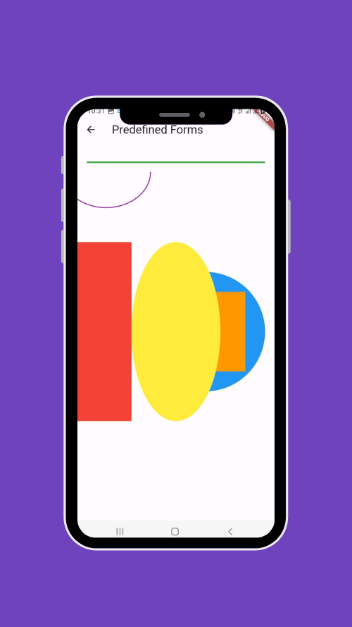
Try playing around with the values to better understand how this method works.
The Path
We know how to draw predefined shapes, in case you want to draw a custom shape you have to combine the different predefined shapes which could be quite difficult to do.
For example, if you want to draw a triangle, you can draw three lines that you're going to make sure to bring together, but what would you do if you want this triangle to be filled with yellow, for example? That would be complicated...
That's the goal of Path which allows you to create open or closed custom shapes.
Its working principle is such that you place yourself somewhere on your Canvas and then you use its different methods to draw the predefined shapes, once it's done you close your path and you use the drawPath method of the canvas to draw it.
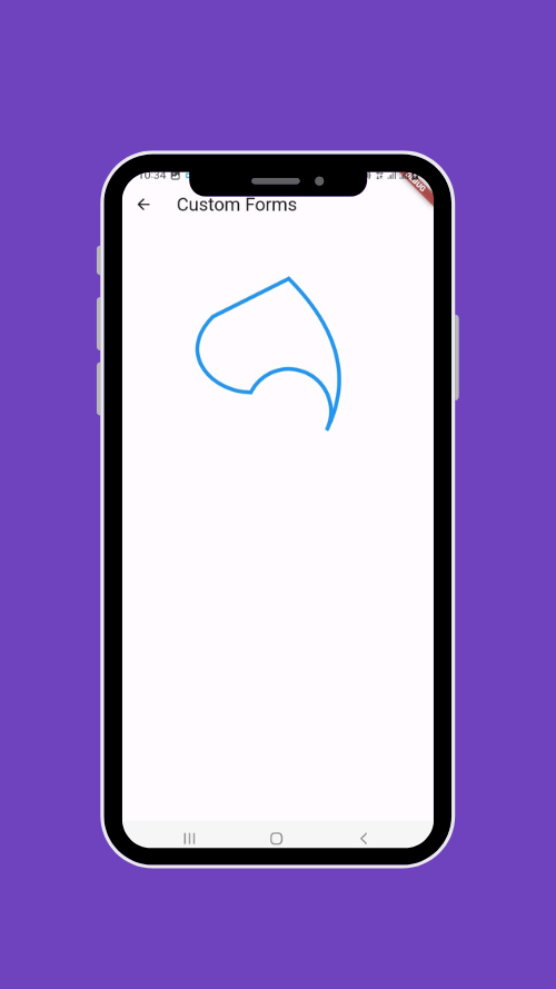
Example 1
final path = Path();
path.moveTo(100, 100);
path.lineTo(200, 50);
path.quadraticBezierTo(300, 150, 250, 250);
path.arcToPoint(Offset(150, 200), radius: Radius.circular(40), clockwise: false);
path.cubicTo(100, 200, 50, 150, 100, 100);
path.close();

final paint = Paint()
  ..color = Colors.blue
  ..strokeWidth = 5
  ..style = PaintingStyle.stroke;

canvas.drawPath(path, paint);
We position ourselves at the point (100, 100) with moveTo
We use lineTo to draw a line to the point (200, 50)
We use the method quadraticBezierTo to draw a quadratic bézier curve (defined by three points) from the current point to point (250, 250) to point (300, 150)
We draw an arc with arcToPoint which takes as parameters the endpoint, the radius, and the direction of the arc (in our case the arc goes counterclockwise).
We use cubicTo to draw a Béziers curve, this time cubic (defined by four points), which goes from the current point to (100, 100) via points (100, 200) and (50, 150)
We close the shape with the close method.
We call drawPath to show the shape.
The result:
Do a lot of exercises with the different methods of Path that you will find in the documentation to better understand it and know how to use them concerning your needs.
Example 2
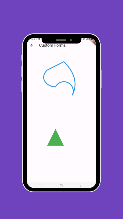
This one is much easier 😮💨, we will draw a triangle.
final paintTriangle = Paint()
  ..color = Colors.green
  ..strokeWidth = 2
  ..style = PaintingStyle.fill;

final pathTriangle = Path();
pathTriangle.moveTo(100, 550);
pathTriangle.lineTo(200, 550);
pathTriangle.lineTo(150, 450);
pathTriangle.close();

canvas.drawPath(pathTriangle, paintTriangle);
If you've been following this tutorial well from the beginning, you shouldn't have any difficulty to understand this snippet of code.
We create our green paint object with a closed style, we position ourselves with our path at the point (100, 550), we draw a line to (200, 550), we draw a second line to (150, 450) finally, we close our path which gives us our little green triangle.
First Test: Drawing a House
Project's presentation
I can assure you that at this level you have a good foundation for creating different types of custom components with Custom Painters. It's time for our first test.
In this first test, we're going to draw a simple house to use some of the concepts we saw earlier.
It will consist of a roof, a chimney, a door with the owner's name, and a window; It will also be possible to customize the color of the house.
Initialization
We need 3 classes:
HousePainter
The CustomPainter where we're going to put all the code regarding the drawing. It takes a title (the owner's house) and the main color of the house.
class HousePainter extends CustomPainter {

  final String title;
  final Color color;

  const HousePainter({required this.title, required this.color});

  @override
  void paint(Canvas canvas, Size size) {
    // the code to draw the house
  }

  @override
  bool shouldRepaint(covariant CustomPainter oldDelegate) {
    // We don't need to repain the CustomPainter
    return false;
  }

}
PaintHouse
The widget's container of the custom painter
class PaintHouse extends StatelessWidget {

  const PaintHouse({Key? key,}) : super(key: key);

  @override
  Widget build(BuildContext context) {
    return CustomPaint(
      painter: HousePainter(
        title: 'Dash\'s House',
        color: Theme.of(context).colorScheme.primary
      ),
    );
  }
}
HousePage
This is our main page, we could combine it with PaintHouse but we prefer to separate them for better reuse, for example, we can easily call PaintHouse on another page.
class HousePage extends StatelessWidget {

  const HousePage({Key? key,}) : super(key: key);

  @override
  Widget build(BuildContext context) {
    return Scaffold(
      appBar: AppBar(title: const Text('House Page')),
      body: Container(
        width: MediaQuery.of(context).size.width,
        height: MediaQuery.of(context).size.height,
        padding: const EdgeInsets.all(pagePadding),
        child: const PaintHouse(),
      ),
    );
  }

}
The Roof
final paintRoof = Paint()
  ..color = color
  ..strokeWidth = 2
  ..style = PaintingStyle.fill;

double roofHeight = size.height / 3;
final path = Path()
  ..moveTo(0, roofHeight)
  ..lineTo(size.width / 2, 0)
  ..lineTo(size.width, roofHeight)
  ..close();

canvas.drawPath(path, paintRoof);
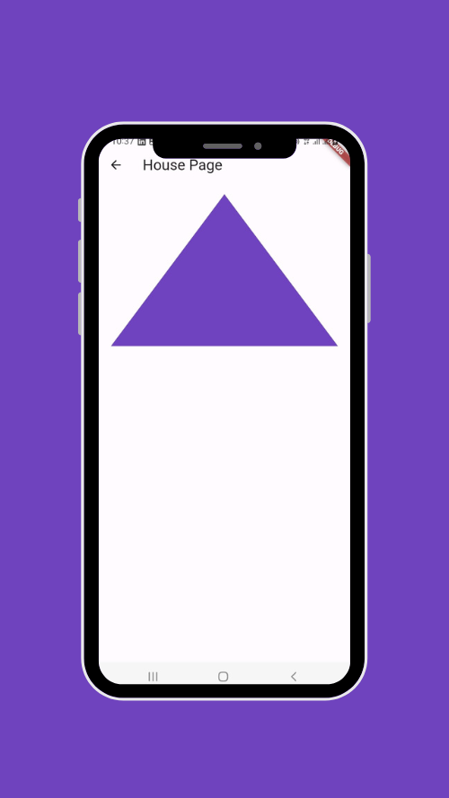
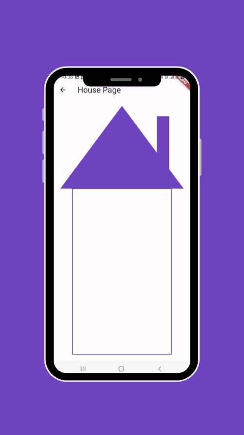
We draw our roof which is a triangular shape, it takes the main color of the house, and whose height represents 1/3 of the total height.
We use the path to do that, you can review the section on the subject for more details.
The chimney
final paintChimney = Paint()
  ..color = color
  ..strokeWidth = 2
  ..style = PaintingStyle.fill;

double chimneyWidth = size.width / 10;
double chimneyHeight = size.height / 4;
double chimneyCenterX = size.width / 1.2;
double chimneyCenterY = roofHeight / 2;

canvas.drawRect(
    Rect.fromCenter(
      center: Offset(chimneyCenterX, chimneyCenterY),
      width: chimneyWidth,
      height: chimneyHeight,
    ),
    paintChimney
);
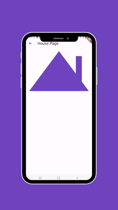
We give a height and width to our chimney and we draw our rectangular chimney from a center that we place strategically so that our chimney is to the right of the roof.
The body of the house
final paintHouse = Paint()
  ..color = color
  ..strokeWidth = 2
  ..style = PaintingStyle.stroke;

double paddingFromRoof = size.width / 10;
final pathHouse = Path()
  ..moveTo(paddingFromRoof, roofHeight)
  ..lineTo(paddingFromRoof, size.height)
  ..lineTo(size.width - paddingFromRoof, size.height)
  ..lineTo(size.width - paddingFromRoof, roofHeight)
  ..close();

canvas.drawPath(pathHouse, paintHouse);
We put a margin so that the bottom part doesn't take up the entire width of the roof, we start drawing from the end of the roof downwards, and this part goes to the end of our full height.
Quick exercise: do the same thing this time using the drawRect method of the canvas.
The door
final paintDoor = Paint()
  ..color = color
  ..strokeWidth = 2
  ..style = PaintingStyle.fill;

double doorWidth = size.width / 3.5;
double doorHeight = size.height / 2.8;
double doorCenterX = size.width / 2;
double doorCenterY = size.height - doorHeight / 2;

canvas.drawRect(
    Rect.fromCenter(
      center: Offset(doorCenterX, doorCenterY),
      width: doorWidth,
      height: doorHeight,
    ),
    paintDoor
);
The concept is the same as in the creation of the chimney; We specify the width and height of our door and draw it from a center that we place strategically so that the door is in the middle at the bottom of the house.

The Door Handle
final paintDoorKnob = Paint()
  ..color = Colors.black
  ..strokeWidth = 2
  ..style = PaintingStyle.fill;

double doorKnobRadius = 10;
canvas.drawCircle(
  Offset(
    size.width / 2 + doorWidth / 2 - (doorKnobRadius + 8),
    size.height - doorHeight / 2
  ),
  doorKnobRadius, paintDoorKnob
);
The handle is a simple black circle; We place the center in the center right of our door.
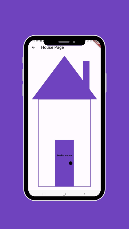
You'll notice there's the title above the handle, here's how it was done:
TextSpan span = TextSpan(
  style: const TextStyle(
    color: Colors.black,
    fontSize: 14,
    fontWeight: FontWeight.bold,
  ),
  text: title,
);

TextPainter tp = TextPainter(
  text: span,
  textAlign: TextAlign.center,
  textDirection: TextDirection.ltr,
);
tp.layout();
tp.paint(
  canvas,
  Offset(
    size.width / 2 - tp.width / 2,
    size.height - doorHeight / 1.5 - tp.height / 2
  )
);
If you're a regular Flutter developer, you've probably used or heard of TextSpan which is a class that allows you to create stylized text segments.
The TextPainter understands the Textpan to draw it on the canvas.
Before drawing our text, it is essential to call layout which is used to calculate the size of the text.
Finally, we draw our text by calling paint which draws on a given position, in our case we make sure that the text is a little above the middle of the door and therefore above the handle.
The window
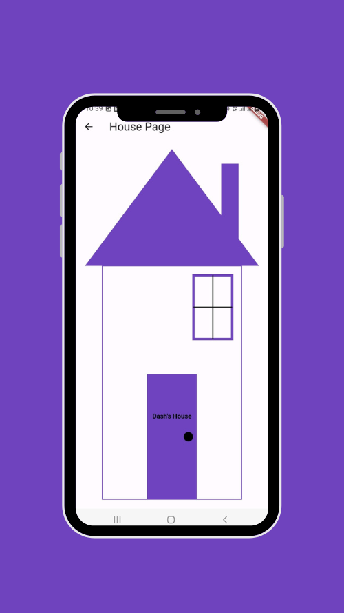
We want to draw our window, which is a square with a horizontal and vertical line inside to create the window panes.
final paintWindow = Paint()
  ..color = color
  ..strokeWidth = 5
  ..style = PaintingStyle.stroke;
double windowWidth = size.width / 4.5;
double windowHeight = size.height / 5.5;

canvas.drawRect(
    Rect.fromCenter(
      center: Offset(size.width - paddingFromRoof - 20 - (windowWidth / 2), roofHeight + 20 + (windowHeight / 2)),
      width: windowWidth,
      height: windowHeight,
    ),
    paintWindow
);

// the window panes (les carreaux de la fenêtre)
final paintWindowPanes = Paint()
  ..color = Colors.black
  ..strokeWidth = 2
  ..style = PaintingStyle.stroke;

canvas.drawLine(
    Offset(size.width - paddingFromRoof - 20 - (windowWidth / 2), roofHeight + 20),
    Offset(size.width - paddingFromRoof - 20 - (windowWidth / 2), roofHeight + 20 + windowHeight),
    paintWindowPanes
);

canvas.drawLine(
    Offset(size.width - paddingFromRoof - 20 - (windowWidth / 2) - (windowWidth / 2), roofHeight + 20 + (windowHeight / 2)),
    Offset(size.width - paddingFromRoof - 20 - (windowWidth / 2) + (windowWidth / 2), roofHeight + 20 + (windowHeight / 2)),
    paintWindowPanes
);
We draw the container of the window which is a simple square made from a center that we place so that the window is located at the top right of the body of the house, finally, we cross the window by a vertical line and a horizontal line.
Reuse of the component
At this point our component is ready, we can reuse it as we want.
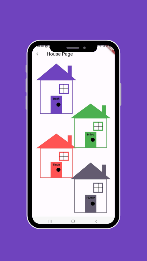
Why not create a neighborhood that is made up of several houses of different colors with different owners?
Let's modify the PaintHouse class for this:
Stack(
  children: [
    Align(
      alignment: Alignment.topLeft,
      child: CustomPaint(
        painter: HousePainter(
          title: 'Dash',
          color: Theme.of(context).colorScheme.primary
        ),
        size: const Size(200, 250),
      ),
    ),
    const Positioned(
      top: 350,
      left: 0,
      child: CustomPaint(
        painter: HousePainter(
            title: 'Tintin',
            color: Colors.redAccent
        ),
        size: Size(200, 220),
      ),
    ),
    const Positioned(
      top: 200,
      right: 0,
      child: CustomPaint(
        painter: HousePainter(
            title: 'Milou',
            color: Colors.green
        ),
        size: Size(200, 220),
      ),
    ),
    Align(
      alignment: Alignment.bottomRight,
      child: CustomPaint(
        painter: HousePainter(
            title: 'Flutter',
            color: Theme.of(context).colorScheme.secondary
        ),
        size: const Size(200, 250),
      ),
    ),
  ],
)
We've just created four HousePaint components that we've aligned in disorder, which gives:
Test Two: an Animated World Clock
Project's presentation
Now, let's move on to a more complex test to show how much further it is possible to go with the CustomPainter by creating custom components of all types.
We're going to create a world analog clock using the CustomPainter of course, and at the end, we're going to see how we can use animations to make our components even more attractive.
Initialization
As in the previous example, we will need 3 classes:
ClockPainter
The CustomPainter where we're going to put all the code about the clock, it takes the main color of the clock as a parameter.
class ClockPainter extends CustomPainter {

  final Color color;

  const ClockPainter({
    this.color = Colors.blue,
  });

  @override
  void paint(Canvas canvas, Size size) {

  }

  @override
  bool shouldRepaint(covariant CustomPainter oldDelegate) {
    // true because the clock should update every second
    return true;
  }

}
PaintClock
The widget that will contain our custom painter, is in Stateful so that it updates the clock every second.
class PaintClock extends StatefulWidget {

  const PaintClock({Key? key,}) : super(key: key);

  @override
  State<PaintClock> createState() => _PaintClockState();
}

class _PaintClockState extends State<PaintClock> {

  @override
  void initState() {
    super.initState();
  }

  @override
  Widget build(BuildContext context) {

    return CustomPaint(
      painter: ClockPainter(color: Theme.of(context).colorScheme.primary),
    );

  }

}
ClockPage
The main clock page in our app.
class ClockPage extends StatelessWidget {

  const ClockPage({Key? key,}) : super(key: key);

  @override
  Widget build(BuildContext context) {
    return Scaffold(
      appBar: AppBar(title: const Text('Clock Page')),
      body: Container(
        width: MediaQuery.of(context).size.width,
        height: MediaQuery.of(context).size.height,
        padding: const EdgeInsets.all(16),
        child: const PaintClock(),
      ),
    );
  }

}
Clock Support
The support of our clock will be a simple square (you can easily do it 😉).
For more aesthetics, we're going to add small circles in our square.
Let's create a method that will allow us to draw each circle in the main square.
void _drawStyleCircle({
  required Canvas canvas,
  required Size size,
  required int lineIndex,
  required int columnIndex}) {
  final paint = Paint()
    ..color = Colors.white.withOpacity(0.7)
    ..strokeWidth = 2
    ..style = PaintingStyle.stroke;

  Offset point = Offset(columnIndex * size.width, lineIndex * size.height);
  canvas.drawCircle(point, size.width / 2, paint);

}
The method takes as parameters the canvas on which we are going to draw, the size of the circle, the index of the row, and the index of the column.
We created our paint object which will have a transparent white color, a thickness of 2, and a stroke style to not fill the circle with a color.
We define the central point of our circle which depends on the row and column we are on so that the circles follow each other.
We can finally draw the support and these inner circles like this:
final paint = Paint()
  ..color = color
  ..strokeWidth = 2
  ..style = PaintingStyle.fill;

canvas.drawRect(Rect.fromLTWH(0, 0, size.width, size.height), paint);

// add some style by drawing  circles
int lineIndex = 0, columnIndex = 0;
while (lineIndex < 5) {

  while (columnIndex < 5) {
    _drawStyleCircle(canvas:  canvas, size: const Size(100, 100),
        lineIndex: lineIndex, columnIndex: columnIndex);
    columnIndex++;
  }
  columnIndex = 0;
  lineIndex++;
}
We draw the main container which has the main color of the clock.
We draw the circles on 5 rows and 5 columns using the method _drawStyleCircle.
Here is the result:
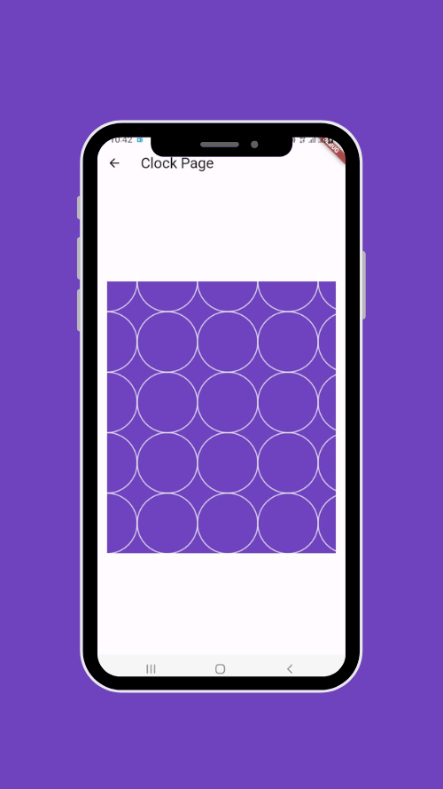
Depending on the size of our screen, it is possible that some circles are not visible or that the size is so large that the circles are displayed on part of the square, you can try to adapt this so that it will look the same regardless of the size of the screen.
The clock's circle
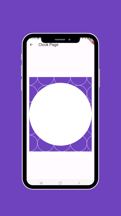
We've got our holder, now we want the hands and other components of the clock to be in an internal holder, this time in a circle.
final radius = size.width / 2;

final paintClockCircle = Paint()
  ..color = Colors.white
  ..strokeWidth = 2
  ..style = PaintingStyle.fill;

Offset center = Offset(size.width / 2, size.height / 2);
canvas.drawCircle(center, radius, paintClockCircle);
We put the center of our circle in the middle. For the circle to take up the entire width of our space, we give it a radius equal to half the width of our square.
Indicators
The serious stuff is starting now.
To place the numbers in their respective places we need to know their angles, since the CustomPainter supports radians, we need to convert all angles to radians, since pi equals 180° the formula radians = angle * pi / 180.
double _getRadians(double angle) {
  return angle * pi / 180;

}
Here is a diagram to better understand the position of angles and their conversion to radians. The values of the radians are outside the circles while those of the degrees are inside.

Degree-Radian Conversion — Wikimedia
You can already see the positions where the numbers should be, for example, 3 will be at 0° so 2π radians, and 6 will be at 270° so 3π/2 radians,...
canvas.translate(size.width / 2, size.height / 2);

TextPainter textPainter = TextPainter(
  textDirection: TextDirection.ltr,
  textAlign: TextAlign.center,
);

for (int i = 1; i <= 12; i++) {

  textPainter.text = TextSpan(
    text: '$i',
    style: const TextStyle(
      color: Colors.black,
      fontSize: 20,
      fontWeight: FontWeight.bold,
    ),
  );
  textPainter.layout();

  double angle = (i - 3) * 30;
  double x = cos(_getRadians(angle)) * (radius - 30) - textPainter.width / 2;
  double y = sin(_getRadians(angle)) * (radius - 30) - textPainter.height / 2;
  textPainter.paint(canvas, Offset(x, y));
}
Here is what happens:
The translate method is used to move the
Canvasorigin in the center. This makes it easier to draw the clock, as you can now draw the clock around the origin (0, 0) instead of having to calculate the coordinates relative to the upper left corner of theCanvas.We create our loop to draw the numbers on the clock from 1 to 12.
We mention the values of our numbers that correspond to the iterator i using the textPainter.
double angle = (i — 3)* 30;: This line calculates the angle where the number will be drawn. We decrease by 3 because remember 0° corresponds to the location of number 3 and we multiply by 30 because each number is drawn 30 degrees from the previous one, since a complete circle is 360 degrees and there are 12 numbers.The trigonometric functions sine and cosine are used to determine the positions along a circle, cosine for the horizontal axis, and sine for the vertical. We give them the angle in radians that we multiply by the radius of the circle to place them at the end of it, at the end, we reduce by half the size of the text to center it.
Once we've done our calculations, we can display our text on the canvas.
The result is quite satisfying 😊

Beautiful, isn't it? A little more effort, we're almost there...
The clock's hands
This section is the last complex section of this tutorial; The hour, minute, and second hands will have to be placed in the right place with the current time.
We need to retrieve the current date time, let's modify the ClockPainter class as follows:
final Color color;
late DateTime _datetime;

ClockPainter({
  this.color = Colors.blue,
});

@override
void paint(Canvas canvas, Size size) {

  _datetime = DateTime.now();

  ...

}
I prefer to create separate methods for each hand to better explain the principle.
All three methods take as parameters the Canvas on which we draw, the radius that will allow us to know how far the line will be drawn, and finally the thickness of the width of our needle.
The hour hand
void _paintHourHand(Canvas canvas, double radius, double strokeWidth) {
  double angle = (_datetime.hour % 12 + _datetime.minute / 60.0 - 3) * 30;
  Offset handOffset = Offset(cos(_getRadians(angle)) * radius,
      sin(_getRadians(angle)) * radius);
  final handPaint = Paint()
    ..color = Colors.black
    ..strokeWidth = strokeWidth;
  canvas.drawLine(const Offset(0, 0), handOffset, handPaint);
}
The angle
Hours are represented over 12 hours; If we have 13 o'clock, for example, the hand must point to 1 hence the datetime.hour % 12, to this we add datetime.minute / 60.0 because the position of the hour hand also depends on the current minute, we reduce by 3 because as said above 0° is at the level of the digit 3, otherwise 3 o'clock, for example, will be displayed at 6.
At the end we multiply by 30 because the complete turn of the circle is 360°, since we have 12 digits that represent the time, each part will have 360 / 12 = 30°.
The point
Now that we have our angle, we can determine the end point of our hand.
Remember, sine and cosine allow us to position ourselves on the horizontal and vertical axis, we give them our angle in radians and we multiply the value by our radius to get the position of our point.
Drawing
We can finally draw our hand that goes from our center which is 0,0 to the second point that we found earlier.
The minute hand
void _paintMinuteHand(Canvas canvas, double radius, double strokeWidth) {
  double angle = (_datetime.minute - 15.0) * 6;
  Offset handOffset = Offset(cos(_getRadians(angle)) * radius,
      sin(_getRadians(angle)) * radius);
  final handPaint = Paint()
    ..color = Colors.black
    ..strokeWidth = strokeWidth;
  canvas.drawLine(const Offset(0, 0), handOffset, handPaint);
}
The angle
The principle is almost the same as for the hours, except that things are even simpler here.
We decrease the minute by 15 because, as said above, 0° is at the level of the number 3, except that, unlike the hours, the minutes and seconds are represented on 60 numbers, so 5 times as many hours, hence 3 X 5 which gives 15.
At the end we multiply by 6 because the complete turn of the circle is 360°, since we have 60 digits that represent the minute and the second, each part will have 360 / 60 = 6°.
From here, the rest is exactly the same as at the hour hand.
The second hand
void _paintSecondHand(Canvas canvas, double radius, double strokeWidth) {
  double angle = (_datetime.second - 15.0) * 6;
  Offset handOffset = Offset(cos(_getRadians(angle)) * radius,
      sin(_getRadians(angle)) * radius);
  final handPaint = Paint()
    ..color = Colors.red
    ..strokeWidth = strokeWidth;
  canvas.drawLine(const Offset(0, 0), handOffset, handPaint);
}
Here, everything is done like on the minute's hand, since the second hand is also represented in 60 digits. The only difference is the color we give to our hand, which is red.
All we have to do now is to use our methods:
double maxRadius = 150;
double maxStroke = 6;
_paintHourHand(canvas, maxRadius / 2.5, maxStroke);
_paintMinuteHand(canvas, maxRadius / 1.5, maxStroke / 1.4);
_paintSecondHand(canvas, maxRadius / 1.2, maxStroke / 3);
A maximum radius is set so that all hands do not extend beyond the circle.
Our hands will be well drawn; As a bonus, we're going to add a dot in the center, which will allow us to learn another method of canvas.
Paint centerPointPaint = Paint()
  ..strokeWidth = (radius / 12)
  ..strokeCap = StrokeCap.round
  ..color = Colors.black;
canvas.drawPoints(ui.PointMode.points, const [Offset(0, 0)], centerPointPaint);
To draw a point, we use the method drawPoints which allows you to draw one or more points on specific positions from a mode coming from PointMode (from the dart:ui library), in our case we use PointMode.points.
Let's see the result:
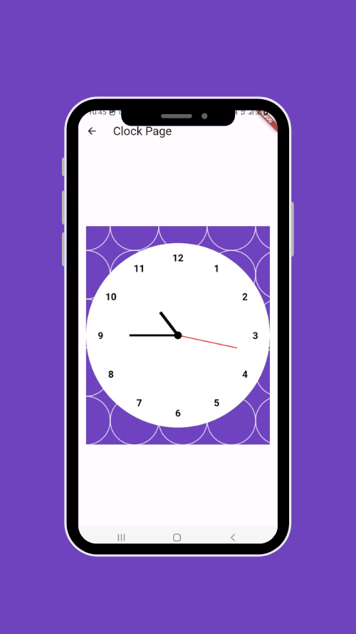
If you refresh the page, the hands will change from the current dateTime.
Automatic Clock Update
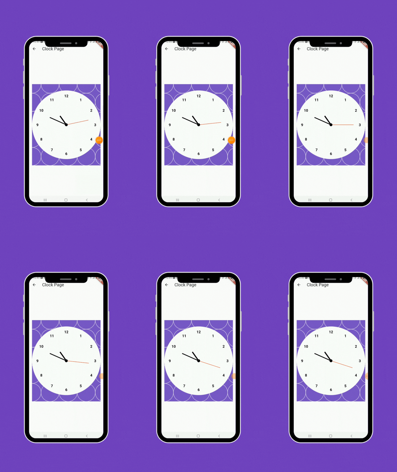
For now, our clock is static, it's time to bring it to life. We need to update the display every second; To do this, we'll use a Timer in _PaintClockState.
class _PaintClockState extends State<PaintClock> {

  Timer? _timer;

  @override
  void initState() {
    super.initState();
    // update the clock every second
    _timer = Timer.periodic(const Duration(seconds: 1), (timer) {
      setState(() {});
    });
  }

  @override
  Widget build(BuildContext context) {

    return CustomPaint(
      painter: ClockPainter(color: Theme.of(context).colorScheme.primary),
    );

  }

  @override
  void dispose() {
    _timer?.cancel();
    super.dispose();
  }

}
At the initState level, we create a periodic timer of one second, at each period we update our page using setState. Never forget to release the timer after use with the cancel method in our class.
We've done the hard part, our clock is working properly 😍😍😍
From the device to the world
At the moment the clock works correctly by displaying the time of the device, but we said that we want to create a world clock.
To start we will manually specify the location, the time zone, and the color, and as a bonus, we will add a small flag to show which country it is.
To have a clean code, we're going to create a class named PlaceClock that will contain the details mentioned above.
import 'package:flutter/material.dart';
import 'package:timezone/timezone.dart' as tz;

class PlaceClock {

  final String name;
  final String flag;
  String timeZone;
  Color color;

  PlaceClock({
    required this.name,
    required this.flag,
    required this.timeZone,
    required this.color,
  });

  DateTime get dateTime {
    tz.Location location = tz.getLocation(timeZone);
    return tz.TZDateTime.now(location);
  }

}
Let's focus on timeZone, it will help us to easily change the value with the place we want to display.
To retrieve the dateTime from the time zone, we need the timezone package.
Once you add it, it is necessary to initialize it from the main.dart file in this way:
import 'package:timezone/data/latest.dart' as tz;

void main() {
  tz.initializeTimeZones();
  runApp(const MyApp());
}
We will no longer need to take the color in the ClockPainter, we will now take a PlaceClock object as a parameter, we will no longer need _dateTime, this value will come from our place object.
Finally, we draw our flag on top of the clock as text from a simple emoji.
class ClockPainter extends CustomPainter {

  final PlaceClock place;

  ClockPainter({
    required this.place,
  });

  @override
  void paint(Canvas canvas, Size size) {

    // a square container
    final paint = Paint()
      ..color = place.color
      ..strokeWidth = 2
      ..style = PaintingStyle.fill;

    /// rest of the code

    // write the country emoji flag at the top under the clock numbers
    TextSpan span = TextSpan(
      text: place.flag,
      style: const TextStyle(
        color: Colors.black,
        fontSize: 25,
      ),
    );

    TextPainter tp = TextPainter(
      text: span,
      textAlign: TextAlign.center,
      textDirection: TextDirection.ltr,
    );
    tp.layout();
    tp.paint(canvas, Offset(-tp.width / 2, -radius + 50));

  }

  /// rest of the code

  /// drawing hour hand
  void _paintHourHand(Canvas canvas, double radius, double strokeWidth) {
    double angle = (place.dateTime.hour % 12 + place.dateTime.minute / 60.0 - 3) * 30;

    /// rest of the code

  }

  /// drawing minute hand
  void _paintMinuteHand(Canvas canvas, double radius, double strokeWidth) {
    double angle = (place.dateTime.minute - 15.0) * 6;

    /// rest of the code

  }

  /// drawing second hand
  void _paintSecondHand(Canvas canvas, double radius, double strokeWidth) {
    double angle = (place.dateTime.second - 15.0) * 6;

    /// rest of the code

  }

}
Now we need to set a place from _PaintClockState as a parameter:
PlaceClock place = const PlaceClock(
  flag: '🇨🇩',
  color: Color(0xFF0087FF),
  name: 'Lubumbashi',
  timeZone: 'Africa/Lubumbashi',
);

return CustomPaint(
  painter: ClockPainter(place: place),
);
Let's see the result:
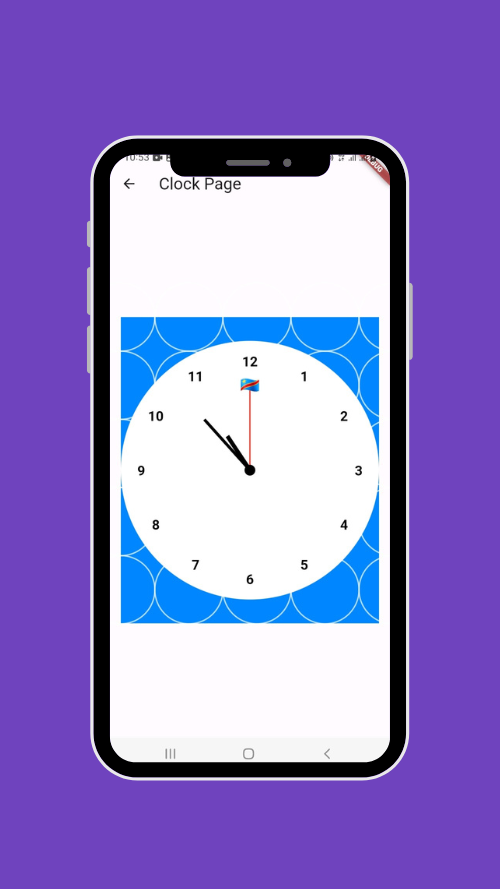
You can change the place contents to see other results.
Change the city
We're almost at the end, let's now add buttons so that we can change places with a simple click.
All changes will be made in _PaintClockState.
Variables
int _index = 0;
List<PlaceClock> places = [
  const PlaceClock(
    flag: '🇨🇩',
    color: Color(0xFF0087FF),
    name: 'Lubumbashi',
    timeZone: 'Africa/Lubumbashi',
  ),
  const PlaceClock(
    flag: '🇺🇸',
    color: Color(0xFFB2293B),
    name: 'New York',
    timeZone: 'America/New_York',
  ),
  const PlaceClock(
    flag: '🇳🇬',
    color: Color(0xFF00814D),
    name: 'Lagos',
    timeZone: 'Africa/Lagos',
  ),
  const PlaceClock(
    flag: '🇪🇬',
    color: Color(0xFFCD1329),
    name: 'Cairo',
    timeZone: 'Africa/Cairo',
  ),
  const PlaceClock(
    flag: '🇫🇷',
    color: Color(0xFF002996),
    name: 'Paris',
    timeZone: 'Europe/Paris',
  ),
  const PlaceClock(
    flag: '🇨🇳',
    color: Color(0xFFD8230E),
    name: 'Shanghai',
    timeZone: 'Asia/Shanghai',
  ),
  const PlaceClock(
    flag: '🇧🇷',
    color: Color(0xFF009B39),
    name: 'Sao Paulo',
    timeZone: 'America/Sao_Paulo',
  ),
  const PlaceClock(
    flag: '🇬🇧',
    color: Color(0xFF00358D),
    name: 'London',
    timeZone: 'Europe/London',
  ),
  const PlaceClock(
    flag: '🇯🇵',
    color: Color(0xFFBC002C),
    name: 'Tokyo',
    timeZone: 'Asia/Tokyo',
  ),
  const PlaceClock(
    flag: '🇦🇺',
    color: Color(0xFF000082),
    name: 'Sydney',
    timeZone: 'Australia/Sydney',
  ),
  const PlaceClock(
    flag: '🇮🇳',
    color: Color(0xFFFF9932),
    name: 'New Delhi',
    timeZone: 'Asia/Kolkata',
  ),
  const PlaceClock(
    flag: '🇷🇺',
    color: Color(0xFFCC2116),
    name: 'Moscow',
    timeZone: 'Europe/Moscow',
  ),
  const PlaceClock(
    flag: '🇨🇦',
    color: Color(0xFFFF0000),
    name: 'Toronto',
    timeZone: 'America/Toronto',
  ),
];
We need _index that will contain the index of the currently selected city and the list of different squares.
The menu
Our menu will be in the form of a horizontal grid. Let's change the build method of our class.
PlaceClock place = places[_index];

return Column(
  children: [
    Container(
      padding: const EdgeInsets.all(8),
      height: MediaQuery.of(context).size.height * 0.2,
      width: MediaQuery.of(context).size.width,
      decoration: BoxDecoration(
        color: Colors.white.withOpacity(0.5),
        borderRadius: BorderRadius.circular(8),
      ),
      child: Center(
        child: GridView.builder(
          shrinkWrap: true,
          gridDelegate: const SliverGridDelegateWithFixedCrossAxisCount(
            crossAxisCount: 3,
            crossAxisSpacing: 8,
            childAspectRatio: 0.3,
          ),
          scrollDirection: Axis.horizontal,
          itemCount: places.length,
          itemBuilder: (context, index) {
            return Padding(
              padding: const EdgeInsets.symmetric(horizontal: 4),
              child: ElevatedButton(
                style: ElevatedButton.styleFrom(
                  backgroundColor: index == _index ? places[_index].color : Colors.grey[300],
                  foregroundColor: index == _index ? Colors.white : places[index].color,
                  shape: RoundedRectangleBorder(
                    borderRadius: BorderRadius.circular(8),
                  ),
                ),
                child: Text('${places[index].flag} ${places[index].name}'),
                onPressed: () {
                  setState(() {
                    _index = index;
                  });
                },
              ),
            );
          },
        ),
      )
    ),
    SizedBox(height: MediaQuery.of(context).size.height * 0.05),
    SizedBox(
      width: MediaQuery.of(context).size.height / 1.8,
      height: MediaQuery.of(context).size.height / 1.8,
      child: CustomPaint(
        painter: ClockPainter(place: place),
      ),
    )
  ],
);
Each time we click on a place, we update the index which will change the style of the button of the selected place and we also update the parameter we give to our clock.
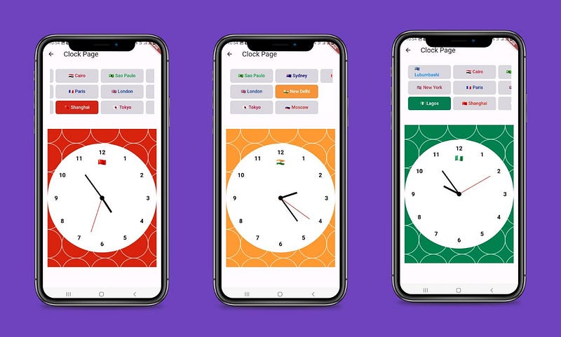
The animations
Our clock is finished, let's add some animations to our clock.
The animations will be called every time there is a change of place, we will create two of them, one for the color and another for the time that will make the hands move.
Introduction
This is not the main focus of our tutorial, we will just give a brief overview of how the animations work, if you want to know more, please check out the documentation.
The animation is done by changing the value of some supported types, such as double or Color.
There are different types of animations, including Tween animations (from between) that animate from one value to another.
Once you instantiate your animation, you need to associate it with an animation controller that will take care of starting or stopping the animation. It is possible to associate multiple animations with a controller and control how they will be called (one after the other, or all at the same time).
Initialization
All changes will be made in _PaintClockState where we will listen to the value change of our animations in order to transmit them to the ClockPainter.
We added with SingleTickerProviderStateMixin at _PaintClockState, to use vsync: this when creating the AnimationController. The vsync means "vertical sync", and it tells Flutter to only draw a new image when the screen is ready for it. This avoids choppy animations and consumes unnecessary processing power.
class _PaintClockState extends State<PaintClock>  with SingleTickerProviderStateMixin {
  ...
}
The Controller
late AnimationController _controller;

@override
void initState() {
  super.initState();

  /// rest of your code

  _controller = AnimationController(
    duration: const Duration(milliseconds: 1000),
    vsync: this,
  )..addListener(() {
    setState(() {});
  });

  /// rest of your code

  _controller.forward(from: 0);
}

@override
void dispose() {
  _timer?.cancel();
  _controller.dispose();
  super.dispose();
}
We initialize our controller to which we give an animation duration of 1000 milliseconds or 1 second, we initialize the vsync we talked about and we add a listener function where we call setState to update our page.
We start the animation as soon as we initialize by using the forward method, which has an optional parameter from which allows us to define at which level we launch our animation.
Like the timer, it is necessary to dispose of the animation controller after use.
Color Animation
Each time we change places, we'll have an animation that changes from the current primary color to the primary color of the place we're clicking on.
Initialization
late Animation<Color?> _animationColor;

@override
void initState() {
  /// rest of your code

  _animationColor = ColorTween(
    begin: places[_index].color.withOpacity(0.5),
    end: places[_index].color,
  ).animate(_controller);

  /// rest of your code
}
Our animation type is ColorTween which automatically supports the animation from one color to another, at initialization we set default colors and link it to our controller through the animate method.
Animation
The animation will be triggered when you click on another location.
setState(() {
  _animationColor = ColorTween(
    begin: places[_index].color,
    end: places[index].color,
  ).animate(_controller);

  _index = index;
});
_controller.forward(from: 0,);
On each click, we update the beginning color of the animation with the current place's color and the end color with the click's place color. We update the index and run the animation through the controller.
Time animation
This animation is about changing the dateTime, but the animation does not directly support the dateTime. To overcome this, we will use the double type which will represent the timestamp that we can convert back to DateTime.
Initialization
late Animation<double> _animationDateTime;

@override
void initState() {
  /// rest of your code

  _animationDateTime = Tween<double>(
    begin: places[_index].dateTime.subtract(const Duration(seconds: 1)).millisecondsSinceEpoch.toDouble(),
    end: places[_index].dateTime.millisecondsSinceEpoch.toDouble(),
  ).animate(_controller);

  /// rest of your code
}
We instantiate the animation with a double Tween, at the initialization, we animate from the previous second to the current time, which will have almost no visual effect.
Animation
setState(() {
  _animationColor = ColorTween(
    begin: places[_index].color,
    end: places[index].color,
  ).animate(_controller);

  DateTime previous = DateTime(
    places[_index].dateTime.year,
    places[_index].dateTime.month,
    places[_index].dateTime.day,
    places[_index].dateTime.hour,
    places[_index].dateTime.minute,
    places[_index].dateTime.second,
  );
  DateTime current = DateTime(
    places[index].dateTime.year,
    places[index].dateTime.month,
    places[index].dateTime.day,
    places[index].dateTime.hour,
    places[index].dateTime.minute,
    places[index].dateTime.second,
  );

  _animationDateTime = Tween<double>(
    begin: previous.millisecondsSinceEpoch.toDouble(),
    end: current.millisecondsSinceEpoch.toDouble(),
  ).animate(_controller);
  _index = index;
});
_controller.forward(from: 0,);
To animate timestamps from one city to another there is a problem, when it is 1 p.m. in Paris and 5 p.m. in New Delhi the timestamp that represents the number of seconds elapsed since 1970 will be the same.
To compensate for this, we manually define the date-times of the start place and the end place, which will have the time zone of the device and therefore different timestamps.
Finalization
Our animation exists and it works but you won't see any changes because the values that we return to the ClockPainter are the same, we have to adapt this to now send the values of the animation.
We can always retrieve the color from the place object because once the animation stops its last value will be the value of our new place.
Regarding the time, we will take the value of the animation only while it is running, once the animation finishes our clock should continue to run.
We'll need to create a dateTime variable that will take either the value of the animation when it's in progress or the value of the dateTime of the place.
ClockPainter:
class ClockPainter extends CustomPainter {

  final PlaceClock place;
  final DateTime dateTime;

  ClockPainter({
    required this.place,
    required this.dateTime,
  });

  /// rest of your code

  /// drawing hour hand
  void _paintHourHand(Canvas canvas, double radius, double strokeWidth) {
    double angle = (dateTime.hour % 12 + dateTime.minute / 60.0 - 3) * 30;
    /// rest of your code
  }

  /// drawing minute hand
  void _paintMinuteHand(Canvas canvas, double radius, double strokeWidth) {
    double angle = (dateTime.minute - 15.0) * 6.0;
    /// rest of your code
  }

  /// drawing second hand
  void _paintSecondHand(Canvas canvas, double radius, double strokeWidth) {

    double angle = dateTime.second - 15.0;
    /// rest of your code
  }

}
_PaintClockState:
class _PaintClockState extends State<PaintClock>  with SingleTickerProviderStateMixin {

  DateTime _dateTime = DateTime.now();

  /// rest of your code

  @override
  Widget build(BuildContext context) {

    /// rest of your code

    return Column(
      children: [
        Container(
          ...
        ),
        SizedBox(height: MediaQuery.of(context).size.height * 0.05),
        SizedBox(
          width: MediaQuery.of(context).size.height / 1.8,
          height: MediaQuery.of(context).size.height / 1.8,
          child: CustomPaint(
            painter: ClockPainter(place: place, dateTime: _dateTime),
          ),
        )
      ],
    );

  }

  /// rest of your code


}
Finally, all we have to do is update the values that we send to the ClockPainter.
@override
Widget build(BuildContext context) {

  PlaceClock place = places[_index]
    .. color = _animationColor.value?? places[_index].color;
  if (_controller.status == AnimationStatus.completed) {
    _dateTime = places[_index].dateTime;
  }
  else {
    _dateTime = DateTime.fromMillisecondsSinceEpoch(_animationDateTime.value.toInt());
  }

  /// rest of your code

}
We change the color of the square according to the color of the animation and the _dateTime takes the value of the animation only when the animation is in progress.
Whew... We are finally ready to see the results of our efforts.
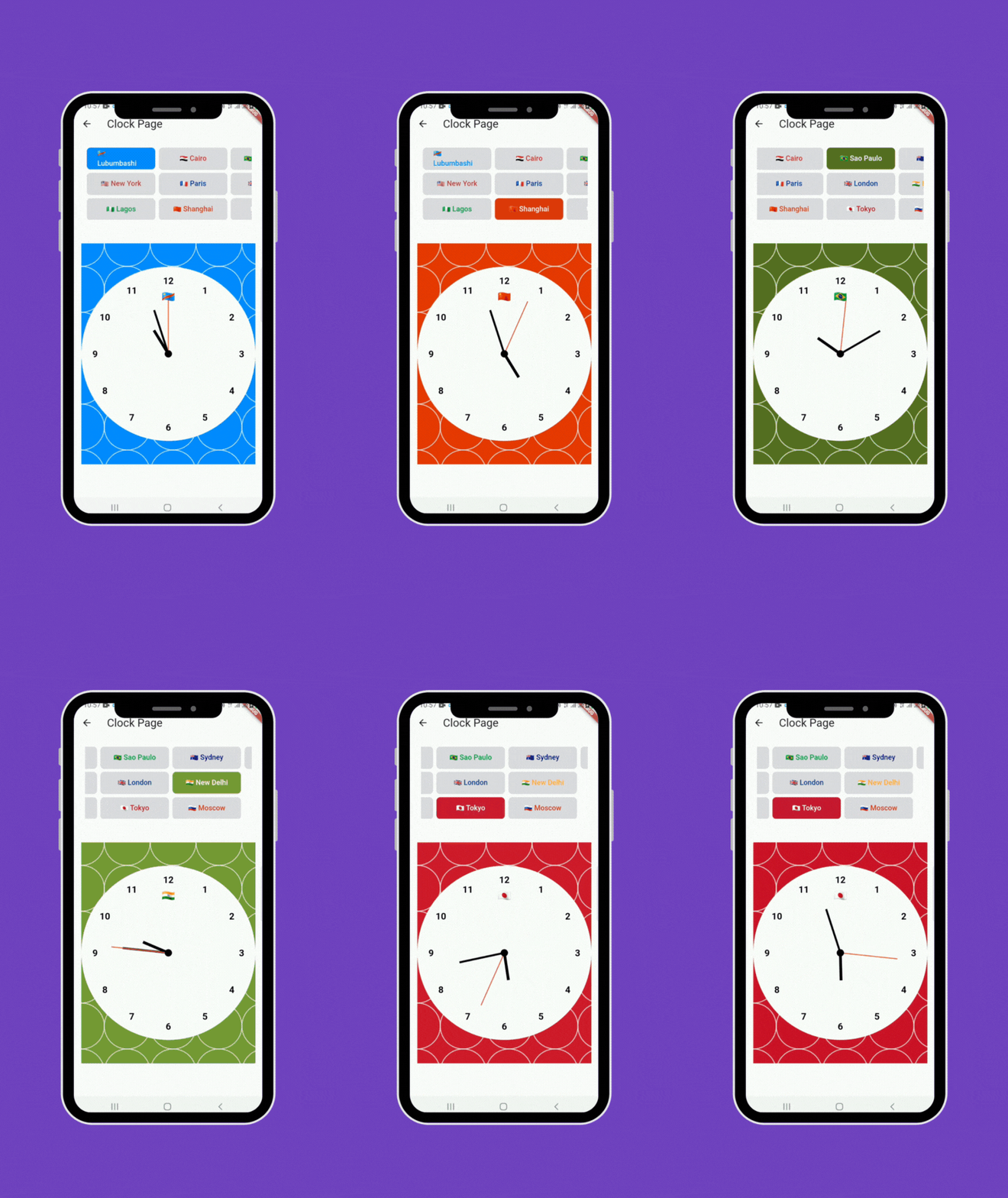
Source code
Find the full source code on GitHub. If you liked my work, feel free to leave a star to encourage me to share more articles.
Conclusion
Even though there are a large number of packages that allow you to create components that do not come natively with Flutter, you may find yourself in a situation where you have to create a component by yourself, in this case, the CustomPainter is your best friend 😊.
It is possible to create various components ranging from the simplest to the most complex, it's up to you to know which CustomPainter method to use to achieve your goals.
References
https://api.flutter.dev/flutter/rendering/CustomPainter-class.html
https://api.flutter.dev/flutter/dart-ui/Canvas-class.html
https://medium.com/flutter-community/a-deep-dive-into-custompaint-in-flutter-47ab44e3f216
https://medium.com/flutterworld/flutter-analog-clock-coding-with-custompaint-7819b3f73fd0
https://medium.com/flutter-community/flutter-animations-comprehensive-guide-cb93b246ca5d
🚀Stay Connected!
Thanks for reading this article! If you enjoyed the content, feel free to follow me on social media to stay updated on the latest updates, tips, and shares about Flutter and development.
👥 Follow me on:
Twitter: lyabs243
LinkedIn: Loïc Yabili
Join our growing and engaging community for exciting discussions on Flutter development! 🚀✨
Thanks for your ongoing support! 🙌✨
